Monday, 9 May 2011

How does your media product represent particular social groups?
My site involves the association with music, which a lot of people would say that its hype is limited to the youth population, however music is one of the most popular aspects of life that we can all share no matter how old/how much money someone has - the majority of people still find the joy in listening/performing to it. That is why I felt that using music helps to connect the world and see it as a more global involvement rather than a single social group. Incorporating social networking sites is allowing different age groups to be involved with this type of thing, attracting the younger audience is important as these are the highest population that are more likely to stumble across the charity/website in the first place. Even if people are not interested in the fund-raising that it promotes; individuals do not have to conform to the ideas of the charity to still be able to donate to it. 
I kept the language on the site quite informal, however the important facts were proposed accordingly. This is to keep the seriousness of the sites aims for the charity and I would not have wanted to stray away from that.  
The colours I have used are fairly sophisticated, for the people who prefer visual layouts - I have included a variety of pictures. But my main aim was to keep it simple, so it is more likely to attract those individuals who prefer "easier to read" websites. It's straight to the point, rather than making it too complicated than it should be. I liked the idea of the live twitter feed as it is relevant to the population of people who closely follow media in this way. It is giving different options of following the progress of the charity.

Tuesday, 3 May 2011

/////evaluation

In what ways does your media product use, develop or challenge forms and conventions of real media products?
My aim for this project was to produce a website that would be able to stand strong in comparison to real life websites on the internet, by fitting in with the general conventions. By using iWeb, I wasn't fully able to create the ideal detail of websites, that the majority of popular websites use, however it was simple and easy to lay out from the ideas I had. It's particularly useful if you have a clear idea about how you want your site to look visually, as the placement of items is relatively simple to match you initial ideas. (Rather than having to use complicated HTML, Javascript with programs like Dreamweaver). I was still able to incorporate html snippets into my website in a simpler form.
Overall my website did manage to look professional and easy to navigate around if I was to compare it with general websites. It was not as technically advanced as most but the basics are there for it to perform well.
From my previous website research I tried to incorporate the main conventions on websites currently by having a unique logo, pictures, news pages, twitter feeds/live feeds of some kind, links to social networking sites (i.e: facebook) as these sites are the most popular way of communication, by linking these you are creating more awareness of the site and will also allow more people to be interested if it is associated with a popular site. I personally found the sites which were plainer to be more appealing, so I kept my colours to a minimum and tried not to overcrowd the components. For charity sites, most had donation buttons clearly visible, to catch the eye of the visitor and I included a link on the sidebar so it was there every page. I didn't use pictures of the 'poverty' that most sites would use to draw people in, but although that may have been hard to achieve - I decided to try and connect 'music' with the charity to hopefully allow more people to pay attention.
Most layouts on the websites I looked at are rather wide and can sometimes be complicated to look at and I decided that I wanted the main body of my website to not be that wide. I liked how much more simple and neater it looks by being smaller. I think it stands out from the other websites as it's not fitting in with the general layout conventions.


Audio-Visual planning

I would like a video on my website which will reflect on the prospects of the website. Ideally I would have liked to take a video of one of the charity gigs in itself, but I think that would be too difficult to organise. Footage of the poverty we would be supporting would also be too tricky, so I am going to recreate some interviews of the artists who are volunteering to help and perhaps show some previews of their songs/work.

storyboard for video


.

Wednesday, 20 April 2011

Final marking

Fabienne, download the checklist from the website and use it assiduously to check that you have done every detail.
You haven't handed in either your preliminary site or your main site. The lack of the preliminary site loses you 15 marks. It makes my part of the work impossible to complete, and the exam board's advice is to penalise work that is late.
HM

Monday, 4 April 2011

News and Events Page


This is my first draft for my 'Media and News' page, it's to be updated regularly (as a feed) to inform the audience of recent news connected to the charity and the latest events - and anything current in the media about the cause or related info.
I'd like to be able to create a scroll bar for this section, rather than having to visit older pages to view previous news.
I'd also like to incorporate a video at the bottom of this page (as a news article), which I will post intended shot lists in the next posts for it.

Sunday, 3 April 2011

Website development using iWeb


Website Layout Sketches

 I have used this template of a guitar for the main focus of the Logo...
Here I used the font I found into the position I wanted and I have started creating my initial idea of having the font incorporating guitar strings. However once I started doing this, I felt the Logo looked stronger when it was simpler. So I am going to use this as my final Logo for my charity :
Today, I started creating my logo in Photoshop, using different fonts I found
I particularly like the last one I tried called 'Iarnold' font. I think I'm going to use this for my final design.

Logo Designs

I've decided to call my charity Listen Up and I've started to create the main Logo for the website...

Thursday, 24 March 2011

Survey Results

...say what survey results mean for the website....

Main Website Survery: surveymonkey.com

I have conducted a survey to help me get an idea of the views/needs of the audience. I hoped it would give me information abut what to include on my website.
I was able to conduct the survey online through social networking sites such as facebook and tumblr (a blog site, which was able to draw results from people worldwide) which gives my survey a higher validity because a broad range of people were included. People answered from the UK, USA, France, Canada, New Zealand and Ireland.
This was useful as my website is intended to reach to other cultures rather than just in the UK.

I had 29 responses with a spread of ages. If I were to do the survey again I would aim to reach out to the older population, to see how their views differ.


I used the site surveymonkey to create my survey. The one I made is still online here: click here to view survey


I have create some graphs and screen shots to help analyse my results better.

the results for whether people preferred to take part in helping the community/country or poverty in the world:


People's music preference (START FROM RESPONSE 5)
indie |||
alternative
acoustic |
folk
electronic ||
rock |
pop ||
hip-hop |
rap
r&b
ambient
drone
instrumental
drum and bass
dubstep
jazz
chillwave
dance
post-punk |
dream pop
trance |

Tuesday, 1 March 2011

From looking at other charities website that deal with the connecting of saving lives with music - I was not impressed with the layouts of the websites. They were almost boring, when compared to other charities. But I guess the whole point is to make an impact, and you'd think that would happen more with a fancy website. Overall there were hardly any colour blues and whites with e

Website Reseach

live8live.com:

musicaid.org:


ifightpoverty.eu:


From looking at other charities website that deal with the connecting of saving lives with music - I was not impressed with the layouts of the websites. They were almost boring, when compared to other charities. But I guess the whole point is to make an impact, and you'd think that would happen more with a fancy website. Overall there were hardly any colour blues and whites with e

Monday, 14 February 2011

Main Website Brief

Following on from Live 8, I will produce a new website which is going to produce a string of new concerts to raise awareness for the fight against extreme poverty; to help get the opinion leaders notice. Last Live 8, an estimated 3 billion people came together to help, they featured 10 concerts with over 1000 musicians and instead of asking people for their money they ask for their voice. This new website will advertise new similar events to help carry through this campaign. They will say that even though last time was a success “The Promises made mean nothing unless they are kept”
Homepage
- Impacting statement on the first page to draw people’s attention
- Including artists that are going to volunteer for the events
- Blog’s and media links to related interests (link to new page LATEST NEWS)
Latest news (Media Center)
- Informing people of current political issues
- The story so far
Page on extreme poverty
- Including how you can get involved – donating to other similar websites
- Videos of problems people face
Concerts
- Pictures of the success of 2005
- Information of the success
- How you can get involved

It should be a simple impacting website, with minimal colours to draw attention to pictures.

Monday, 7 February 2011

Finished Preliminary Site

Here are my completed 2 pages for my website 'River Tree High School':


Sunday, 6 February 2011

Pelimary Site in development

I've taken screenshots of my school website as I created it using iWeb. I reverted to my original plan as much as possible.


Above is the calendar that I began creating in Photoshop. I want to make the dates with events into hyperlinks (pink dates), explaining what is occurring on these dates. This calendar will be placed at the bottom of the home page.


- The Homepage of my website is turning out how I want it, however I need to sort out the font size as it isn't very easy to read
- I may need to change the spacing
- The photo of the school will fit in to the blank box at the top
- I'm considering making the links on the left sidebar slightly closer together, so it looks a bit neater.


Tuesday, 1 February 2011

Logo for Preliminary Site

This is the logo I created in Photoshop for my school
and then I developed this in the header I'm going to use for the top of the Website:


Monday, 31 January 2011

Sketched layouts for school website

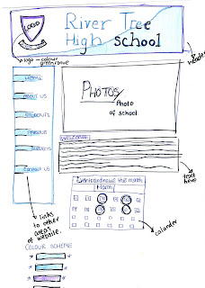
I've sketched up some layouts/plans for the two pages of my school website that I'm creating. (River Tree School)
The colours will be different when I transfer it on to iWeb. I'd prefer to use more subtle purple/blues that on the sketches.
This is the plan for the Home Page, I've left out the main written context:


And the layout for my Media Studies page:

Friday, 28 January 2011

Preliminary Website Brief


We are going to create a website for a new school called Hillside. From carrying out a survey on what people would prefer to see, we found that simple layouts was the most common choice, due to it being easy to use rather than a website that was too overcrowded. Our Survey also suggested that sticking with the school colours would be conventional because it will be identifiable easily and stand out from the others schools. The website should be relatable to the students and the parents so has to meet everyone’s needs, with separate student/teacher areas, clear headers, alternative photographs of the school/student activities as a slide show on the main page, to set the environment (with clickable links to more facilities). We will also have links to subject areas, as this will be one of the main functions that it will be used for. ‘Contact us’ information and ‘News and Events’ links will also be available. 

Thursday, 27 January 2011

Preliminary Site Research

I am going to create a preliminary site, promoting a new school - so I am going to do some research on current school websites, to get ideas and compare the general layouts and features.

I have also annotated some other websites to see the different layouts schools use:

http://frog.lpgs.bromley.sch.uk/

This is the school website for Langley Girls: it’s a very simple layout with minimal colours.
The main focus on this site, is the written welcome by the head teacher, as this is probably the reason why the majority of people would be visiting the site (prospective parents.) I think the site is almost too simple as makes the top header with all the awards
There isn’t a big header, saying what the school name is or anything – so it may take a while to work out what the website is on at first. Especially due to all the awards they have shoved together at the top, which catches all of your attention because these are the most colourful.

http://www.hayes.bromley.sch.uk/


http://www.etoncollege.com/


http://www.lpbs.org.uk/


Looking at all the sites I have annotated, I now how a clearer idea about what the norms are for school websites. Having photos of the school are important and a logo in the top left corner, seems to what most schools do. I like the way that Eton have incorporated the calendar on the first page, so may try this idea with the website I'm going to create. I think the simpler the colours, the better the website looks, I particularly didn't like the colours that Langley Boys School chose, although they were probably trying to incorporate the school theme of their colours.

Friday, 21 January 2011

Experimenting with Photography and Photoshop


We took several pictures throughout our lesson to try and capture the 'school' atmosphere.


I decided to use photo to experiment with using photoshop, as it will be interesting to place in different contexts.


Here I have sectioned out the people, as this is the part of the photo I want to develop further.


other photoshop pictures