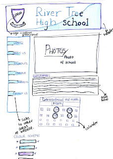
I've sketched up some layouts/plans for the two pages of my school website that I'm creating. (River Tree School)
The colours will be different when I transfer it on to iWeb. I'd prefer to use more subtle purple/blues that on the sketches.
This is the plan for the Home Page, I've left out the main written context:
And the layout for my Media Studies page:
Monday, 31 January 2011
Friday, 28 January 2011
Preliminary Website Brief
We are going to create a website for a new school called Hillside. From carrying out a survey on what people would prefer to see, we found that simple layouts was the most common choice, due to it being easy to use rather than a website that was too overcrowded. Our Survey also suggested that sticking with the school colours would be conventional because it will be identifiable easily and stand out from the others schools. The website should be relatable to the students and the parents so has to meet everyone’s needs, with separate student/teacher areas, clear headers, alternative photographs of the school/student activities as a slide show on the main page, to set the environment (with clickable links to more facilities). We will also have links to subject areas, as this will be one of the main functions that it will be used for. ‘Contact us’ information and ‘News and Events’ links will also be available.
Thursday, 27 January 2011
Preliminary Site Research
I am going to create a preliminary site, promoting a new school - so I am going to do some research on current school websites, to get ideas and compare the general layouts and features.
I have also annotated some other websites to see the different layouts schools use:
http://frog.lpgs.bromley.sch.uk/
This is the school website for Langley Girls: it’s a very simple layout with minimal colours.
The main focus on this site, is the written welcome by the head teacher, as this is probably the reason why the majority of people would be visiting the site (prospective parents.) I think the site is almost too simple as makes the top header with all the awards
There isn’t a big header, saying what the school name is or anything – so it may take a while to work out what the website is on at first. Especially due to all the awards they have shoved together at the top, which catches all of your attention because these are the most colourful.
http://www.hayes.bromley.sch.uk/
http://www.etoncollege.com/
http://www.lpbs.org.uk/
Looking at all the sites I have annotated, I now how a clearer idea about what the norms are for school websites. Having photos of the school are important and a logo in the top left corner, seems to what most schools do. I like the way that Eton have incorporated the calendar on the first page, so may try this idea with the website I'm going to create. I think the simpler the colours, the better the website looks, I particularly didn't like the colours that Langley Boys School chose, although they were probably trying to incorporate the school theme of their colours.
I have also annotated some other websites to see the different layouts schools use:
This is the school website for Langley Girls: it’s a very simple layout with minimal colours.
The main focus on this site, is the written welcome by the head teacher, as this is probably the reason why the majority of people would be visiting the site (prospective parents.) I think the site is almost too simple as makes the top header with all the awards
There isn’t a big header, saying what the school name is or anything – so it may take a while to work out what the website is on at first. Especially due to all the awards they have shoved together at the top, which catches all of your attention because these are the most colourful.
Looking at all the sites I have annotated, I now how a clearer idea about what the norms are for school websites. Having photos of the school are important and a logo in the top left corner, seems to what most schools do. I like the way that Eton have incorporated the calendar on the first page, so may try this idea with the website I'm going to create. I think the simpler the colours, the better the website looks, I particularly didn't like the colours that Langley Boys School chose, although they were probably trying to incorporate the school theme of their colours.
Friday, 21 January 2011
Experimenting with Photography and Photoshop
We took several pictures throughout our lesson to try and capture the 'school' atmosphere.
I decided to use photo to experiment with using photoshop, as it will be interesting to place in different contexts.
Here I have sectioned out the people, as this is the part of the photo I want to develop further.
other photoshop pictures
Subscribe to:
Posts (Atom)


